
Matplotlib is an amazing visualization library in Python for 2D plots of arrays.
For using matplotlib in jupyter notebook, first, you need to import the matplotlib library.
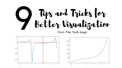
In this blog post, I have discussed a list of 9 tips and tricks that you can use while working with matplotlib.
Originally Posted on my Website — Let’s Discuss Stuff
Tricks and Topics discussed in this blogpost:
- How to change the figure size in matplotlib?
- How to set axis limits in matplotlib?
- How to set titles and labels in matplotlib?
- How to download the plot you made?
- How to add horizontal and vertical lines to the plot you made?
- How to create a plot in log scale using matplotlib?
- How to add a secondary axis to a plot in matplotlib?
- How to add text annotation in a plot in matplotlib?
- How to change the style and background color of a plot in matplotlib?

1. How to change the figure size in matplotlib?
Matplotlib contains an argument figsize inside the plt.figure() the command to change the figure size of the plot. You have to pass the value of x and y as values to the argument.
If you pass (7,5) as an argument then matplotlib will create a plot which is 7 inches in length and 5 inches in breadth.
You can also use dpi the argument to change the value of dots per inch of your plot. More dpi will make the plot make crisper. The default value of dpi is 100.
#first you need to import all the required libraries
import numpy as np
import pandas as pd
import matplotlib.pyplot as plt
import seaborn as sns
x = np.arange(0,5,0.2) # will create values from 0 to 5 at an interval of 0.2 each
y = np.exp(x) + 10*np.sin(x)
plt.plot(x,y)
x = np.arange(0,5,0.2)
y = np.exp(x) + 10*np.sin(x)
plt.figure(figsize = (6,4), dpi = 100)
plt.plot(x,y)

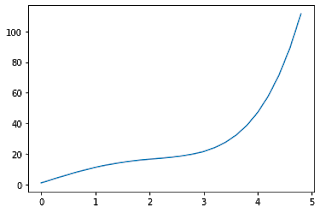
2. How to set axis limits in matplotlib?
The functions xlim() and ylim() are used to set the axis limits for the x-axis and y-axis respectively. You have to pass the minimum value and maximum value as an argument to the function.
x = np.arange(0,5,0.2)
y = np.exp(x) + 10*np.sin(x)
plt.plot(x,y)
plt.xlim(2,5)
plt.ylim(20,80)
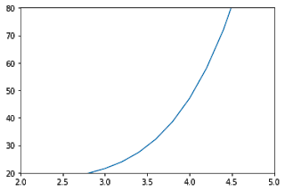
If you don’t want to specify both the minimum and maximum values, you can instead use top and bottom arguments in ylim() function to set the top limit and bottom limit respectively.
Trending AI Articles:
1. Fundamentals of AI, ML and Deep Learning for Product Managers
3. Graph Neural Network for 3D Object Detection in a Point Cloud
4. Know the biggest Notable difference between AI vs. Machine Learning
The other value will remain unchanged.
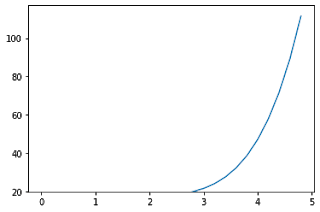
Similarly for xlim() function, you can set left and right value as arguments to set the left and right side limit of the plot.
x = np.arange(0,5,0.2)
y = np.exp(x) + 10*np.sin(x)
plt.plot(x,y)
plt.ylim(bottom = 20)
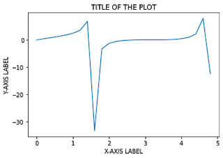
3. How to set titles and labels in matplotlib?
plt.title() – to set the title of the graph
plt.xlabel() – to set the x-axis label of the graph
plt.ylabel() – to set the y-axis label of the graph
Pass the titles and labels inside ” “double or single quotes.
x = np.arange(0,5,0.2)
y = np.tan(x) + np.sin(x)
plt.plot(x,y)
plt.title(" TITLE OF THE PLOT ")
plt.xlabel(" X-AXIS LABEL ")
plt.ylabel(" Y-AXIS LABEL ")
If you want to change the font of the title and labels, you can update the font using rcParams[font.family] and set the value to the respective font that you want to use.
plt.rcParams["font.family"] = "serif"
x = np.arange(0,5,0.2)
y = np.tan(x) + np.sin(x)
plt.plot(x,y)
plt.title(" TITLE OF THE PLOT ")
plt.xlabel(" X-AXIS LABEL ")
plt.ylabel(" Y-AXIS LABEL ")

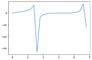
4. How to download the plot you made?
plt.savefig() the function is used to download the graph you made. You need to mention the file name as an argument to the function.
The file will be downloaded in the directory in which you are running the program.
You can set many parameters like dpi, facecolor, edgecolor etc. inside the plt.savefig() function.
x = np.arange(0,5,0.2)
y = np.tan(x) + np.sin(x)
plt.plot(x,y)
plt.savefig("MYNEWPLOT.png")
5. How to add horizontal and vertical lines to the plot you made?
plt.axhline() and plt.axvline() functions are used to plot a horizontal and vertical line respectively.
If you put plt.axhline(5) then it will just add a horizontal line at y=5.
Similarly for plt.axvline(5) then it will add a vertical line at x=5.
x = np.arange(0,5,0.2)
y = np.tan(x) + np.cos(x)
plt.plot(x,y)
plt.axvline(3,color='red')
plt.axhline(0,color='red')
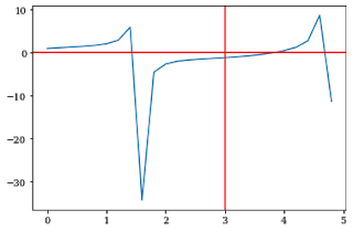
This will create horizontal and vertical lines ranging from maximum to minimum limit on both the x and y-axis.
If you want to set the lower and upper limit, use ymin and ymax as parameters to the plt.axvline() function.
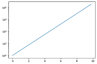
6. How to create a plot in log scale using matplotlib?
plt.yscale() the function is used to change the scale of the y-axis in matplotlib.
Set the argument to log in the plt.yscale() function to create a plot in a logscale.
x = np.arange(0,10,0.2)
y=np.exp(x)
plt.plot(x,y)
plt.yscale("log")
If you want to change the scale in x-axis, then use the plt.xscale() function.
y=np.arange(0,10,0.2)
x=np.exp(y)
plt.plot(x,y)
plt.xscale("log")

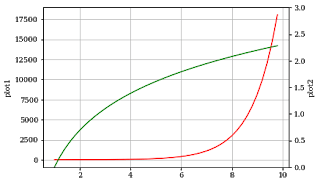
7. How to add a secondary axis to a plot in matplotlib?
twinx() the function is used to do this in matplotlib.
You can represent 2 plots in the same graph, one on a normal scale and others on a different scale on both sides of the graph.
The x-axis autoscale setting will be inherited from the original Axes.
x = np.arange(1, 10, 0.2)
y1 = np.exp(x)
y2 = np.log(x)
fig, ax1 = plt.subplots()
ax1.set_ylabel('plot1')
ax1.plot(x, y1, color='red')
ax1.grid()
ax2 = ax1.twinx()
ax2.set_ylabel('plot2')
ax2.set_ylim(0,3)
ax2.plot(x, y2,color='green')
plt.show()
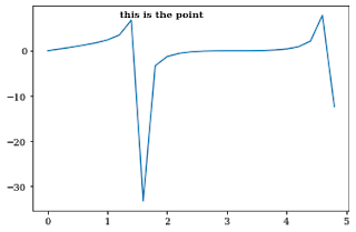
8. How to add text annotation in a plot in matplotlib?
plt.text() the command is used to add text to a plot in matplotlib.
You need to add the text, x-axis, and y-axis value of the point where you need to add text annotation as arguments to the function.
You can also vary parameters like size, color and weight of the text annotation.
x = np.arange(0,5,0.2)
y = np.tan(x) + np.sin(x)
plt.plot(x,y)
plt.text(1.2, 7.5, "this is the point", weight = 'semibold')
Text(1.2, 7.5, 'this is the point')
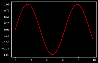
9. How to change the style and background color of a plot in matplotlib?
plt.style.use() the function is used to set the style of the plot in matplotlib. Like for dark style, use dark-background as an argument to the function.
plt.style.use("dark_background")
x = np.arange(0,10,0.2)
y=np.sin(x)
plt.plot(x,y,color='red')
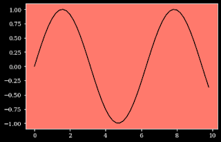
For changing the background color of the plot, you can use the ax.set_facecolor() function which the color as an argument to the function.
x = np.arange(0,10,0.2)
y=np.sin(x)
plt.plot(x,y,color='black')
ax=plt.gca()
ax.set_facecolor('xkcd:salmon')
Thanks for reading through the blog post. Make sure you like and subscribe to my website — Let’s Discuss Stuff if you want to get notified of future content. Consider checking out my other blog posts if you are interested in content like this.
Don’t forget to give us your ? !


9 Tips and Tricks for Better Visualization in Matplotlib was originally published in Becoming Human: Artificial Intelligence Magazine on Medium, where people are continuing the conversation by highlighting and responding to this story.
