
Detecting whether someone suffers pneumonia based on their chest x-ray images.
Hey there! Just finished another deep learning project several hours ago, now I wanna share what I actually did there. So the objective of this challenge is to determine whether a person suffers pneumonia or not, and if yes, then determine whether it’s caused by bacteria or virus. — Well, I think this project should be called as classification instead of detection. — In other words, this task is going to be a multiclass classification problem where the label names are: normal, virus and bacteria. In order to solve this problem, I decided to use CNN (Convolutional Neural Network) thanks to its excellent ability to perform image classification. Not only that, here I also implement image augmentation technique as an approach to improve model performance. By the way, here I obtained 80% of accuracy on test data which is pretty impressive to me.
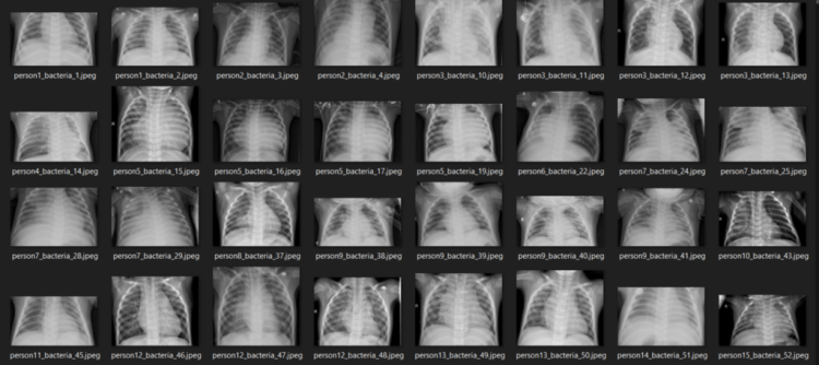
The dataset used in this project can be downloaded from this Kaggle link. The size of the entire dataset itself is around 1 GB, so it might take a while to download. Or, we can also directly create a Kaggle Notebook and code the entire project there, so we don’t even need to download anything. Next, if you explore the dataset folder, you will see that there are 3 sub folders, namely train, test and val. Well, I think those folder names are self-explanatory. In addition, the data in train folder consists of 1341, 1345 and 2530 samples for normal, virus and bacteria class respectively. I think that’s all for the intro, let’s now jump into the code!
Note: I put the entire code used in this project at the end of this article.

Loading modules and train images
The very first thing to do when working with computer vision project is to load all required modules and the image data itself. I use tqdm module to display progress bar which you’ll see why it is useful later on. The last import I do here is ImageDataGenerator coming from Keras module. This module is going to help us implementing image augmentation technique during the training process.
import os
import cv2
import pickle
import numpy as np
import matplotlib.pyplot as plt
import seaborn as sns
from tqdm import tqdm
from sklearn.preprocessing import OneHotEncoder
from sklearn.metrics import confusion_matrix
from keras.models import Model, load_model
from keras.layers import Dense, Input, Conv2D, MaxPool2D, Flatten
from keras.preprocessing.image import ImageDataGenerator
np.random.seed(22)
Next, I define two functions to load image data from each folder. The two functions below might look identical at glance, but there’s actually a little difference at the line with bold text. This is done because the filename structure in NORMAL and PNEUMONIA folders are slightly different. Despite the difference, the other process done by both functions are essentially the same. First, all images are going to be resized to 200 by 200 pixels large. This is important to do since the images in all folders are having different dimensions while neural network can only accept data with fixed array size. Next, basically all images are stored with 3 color channels, which is I think it’s just redundant for x-ray images. So the idea here is to convert all those color images to grayscale.
# Do not forget to include the last slash
def load_normal(norm_path):
    norm_files = np.array(os.listdir(norm_path))
    norm_labels = np.array(['normal']*len(norm_files))

    norm_images = []
    for image in tqdm(norm_files):
        image = cv2.imread(norm_path + image)
        image = cv2.resize(image, dsize=(200,200))
        image = cv2.cvtColor(image, cv2.COLOR_BGR2GRAY)
        norm_images.append(image)

    norm_images = np.array(norm_images)

    return norm_images, norm_labels
def load_pneumonia(pneu_path):
    pneu_files = np.array(os.listdir(pneu_path))
    pneu_labels = np.array([pneu_file.split('_')[1] for pneu_file in pneu_files])

    pneu_images = []
    for image in tqdm(pneu_files):
        image = cv2.imread(pneu_path + image)
        image = cv2.resize(image, dsize=(200,200))
        image = cv2.cvtColor(image, cv2.COLOR_BGR2GRAY)
        pneu_images.append(image)

    pneu_images = np.array(pneu_images)

    return pneu_images, pneu_labels
As the two functions above have been declared, now we can just use it to load train data. If you run the code below you’ll also see why I choose to implement tqdm module in this project.
norm_images, norm_labels = load_normal('/kaggle/input/chest-xray-pneumonia/chest_xray/train/NORMAL/')
pneu_images, pneu_labels = load_pneumonia('/kaggle/input/chest-xray-pneumonia/chest_xray/train/PNEUMONIA/')
Up to this point, we already got several arrays: norm_images, norm_labels, pneu_images and pneu_labels. The one with _images suffix indicates that it contains the preprocessed images while the array with _labels suffix shows that it stores all ground truths (a.k.a. labels). In other words, both norm_images and pneu_images are going to be our X data while the rest are going to be y data. To make things look more straightforward, I decided to concatenate the values of those arrays and store in X_train and y_train array.
X_train = np.append(norm_images, pneu_images, axis=0)
y_train = np.append(norm_labels, pneu_labels)

By the way I obtain the number of images of each class using the following code:

Displaying several images
Well, displaying several images like what I wanna do in this stage is not mandatory. But I just wanna do this anyway just to ensure whether the pictures are already loaded and preprocessed well. The code below is used to display 14 images taken randomly from X_train array along with the labels.
fig, axes = plt.subplots(ncols=7, nrows=2, figsize=(16, 4))

indices = np.random.choice(len(X_train), 14)
counter = 0

for i in range(2):
    for j in range(7):
        axes[i,j].set_title(y_train[indices[counter]])
        axes[i,j].imshow(X_train[indices[counter]], cmap='gray')
        axes[i,j].get_xaxis().set_visible(False)
        axes[i,j].get_yaxis().set_visible(False)
        counter += 1
plt.show()
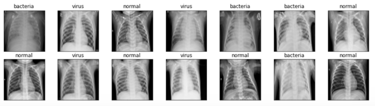
We can see the figure above that all images are now having the exact same size — unlike the one that I use for the cover picture of this post.
Loading test images
As we already know that all train data have been loaded successfully, we can now use the exact same function to load our test data. The steps are pretty much the same, but here I store those loaded data in X_test and y_test array. The data used for testing itself contains 624 samples.
norm_images_test, norm_labels_test = load_normal('/kaggle/input/chest-xray-pneumonia/chest_xray/test/NORMAL/')
pneu_images_test, pneu_labels_test = load_pneumonia('/kaggle/input/chest-xray-pneumonia/chest_xray/test/PNEUMONIA/')
X_test = np.append(norm_images_test, pneu_images_test, axis=0)
y_test = np.append(norm_labels_test, pneu_labels_test)
Furthermore, I notice that it takes pretty long just to load the entire dataset. Hence I decided to save X_train, X_test, y_train and y_test in separate file using pickle module, so that I don’t need to repeat running the codes above next time I wanna use these data again.
# Use this to save variables
with open('pneumonia_data.pickle', 'wb') as f:
    pickle.dump((X_train, X_test, y_train, y_test), f)
# Use this to load variables
with open('pneumonia_data.pickle', 'rb') as f:
    (X_train, X_test, y_train, y_test) = pickle.load(f)
Since all X data have been preprocessed well, now it’s time to work with labels y_train and y_test.
Label preprocessing
At this point, both y variables consist of either normal, bacteria or virus written in string datatype. In fact, such labels are just not acceptable by neural network. Therefore, we need to convert that into one-hot format. Luckily we got OneHotEncoder object taken from Scikit-Learn module which is extremely helpful to do the conversion. In order to do that, we need to begin with creating new axis on both y_train and y_test. (We create this new axis since that’s just the shape expected by OneHotEncoder).
y_train = y_train[:, np.newaxis]
y_test = y_test[:, np.newaxis]
Next, initialize one_hot_encoder like this. Notice that here I pass False as the sparse argument to make the next step kinda simpler. But if you wanna use sparse matrix instead, just go with sparse=True or leave the parameters empty.
one_hot_encoder = OneHotEncoder(sparse=False)
Finally we are going to use this one_hot_encoder to actually convert these y data into one-hot. The encoded labels are then stored in y_train_one_hot and y_test_one_hot. These two arrays are the labels that we will use for the training.
y_train_one_hot = one_hot_encoder.fit_transform(y_train)
y_test_one_hot = one_hot_encoder.transform(y_test)
Reshaping X data into (None, 200, 200, 1)
Now let’s get back to our X_train and X_test. It’s important to know that the shape of these two arrays are (5216, 200, 200) and (624, 200, 200) respectively. Well, at glance, these two shapes look fine as we can just display that using plt.imshow() function. However though, this shape is just not acceptable by convolution layer since it expects color channel to be included as its input. Thus, since this image is essentially colored in grayscale, then we need to add a new axis with 1 dimension which is going to be recognized by the convolution layer as the only color channel. The implementation is not as complicated as my explanation though:
X_train = X_train.reshape(X_train.shape[0], X_train.shape[1], X_train.shape[2], 1)
X_test = X_test.reshape(X_test.shape[0], X_test.shape[1], X_test.shape[2], 1)
Now after running the code above, if we check the shape of both X_train and X_test, then we will see that the shape is now (5216, 200, 200, 1) and (624, 200, 200, 1) respectively.
Trending AI Articles:
2. How AI Will Power the Next Wave of Healthcare Innovation?
Data augmentation
Here’s the part where I have never been working with. So this is my very first time doing data augmentation for image classification task.
Anyway, the main point of augmenting data — or more specifically augmenting train data — is that we are going to increase the number of data used for training by creating more samples with some sort of randomness on each of them. Those randomness might include translations, rotations, scaling, shearing and flips. Such technique is able to help our neural network classifier to reduce overfitting, or in other words, it can make the model generalize data samples better. Luckily, the implementation is very easy thanks to the existence of ImageDataGenerator object which can be imported from Keras module.
datagen = ImageDataGenerator(
        rotation_range = 10,
        zoom_range = 0.1,
        width_shift_range = 0.1,
        height_shift_range = 0.1)
So what I essentially do in the code above is to set the range of randomness. Here’s a link to the documentation of ImageDataGenerator if you wanna know the details of each argument. Next, what we need to do after initializing the datagen object is to fit it with our X_train. This process is then followed by applying flow() method in which this step is useful such that train_gen object is now able to generate batches of augmented data.
datagen.fit(X_train)
train_gen = datagen.flow(X_train, y_train_one_hot, batch_size=32)
CNN (Convolutional Neural Network)
Now it’s time to actually build the neural network architecture. Let’s start with the input layer (input1). So this layer basically takes all the image samples in our X data. Hence we need to ensure that the first layer accepts the exact same shape as the image size. It’s worth noting that what we need to define is only (width, height, channels), instead of (samples, width, height, channels).
Afterwards, this input1 layer is connected to several convolution-pooling layer pairs before eventually being flattened and connected to dense layers. Notice that all hidden layers in the model are using ReLU activation function due to the fact that ReLU is faster to compute compared to sigmoid, and thus, the training time required is shorter. Lastly, the last layer to connect is output1, where it consists of 3 neurons with softmax activation function. Here softmax is used because we want the outputs to be the probability value of each class.
input1 = Input(shape=(X_train.shape[1], X_train.shape[2], 1))

cnn = Conv2D(16, (3, 3), activation='relu', strides=(1, 1),
    padding='same')(input1)
cnn = Conv2D(32, (3, 3), activation='relu', strides=(1, 1),
    padding='same')(cnn)
cnn = MaxPool2D((2, 2))(cnn)

cnn = Conv2D(16, (2, 2), activation='relu', strides=(1, 1),
    padding='same')(cnn)
cnn = Conv2D(32, (2, 2), activation='relu', strides=(1, 1),
    padding='same')(cnn)
cnn = MaxPool2D((2, 2))(cnn)

cnn = Flatten()(cnn)
cnn = Dense(100, activation='relu')(cnn)
cnn = Dense(50, activation='relu')(cnn)
output1 = Dense(3, activation='softmax')(cnn)

model = Model(inputs=input1, outputs=output1)
After constructing the neural network using the code above, we can display the summary of our model by applying summary() to model object. Below is how our CNN model looks like in details. We can see here that we got 8 million params in total — which is a lot. Well, that’s why I run this code on Kaggle notebook.

Anyway, after the model being constructed, now we need to compile the neural net using categorical cross entropy loss function and Adam optimizer. So the loss function is used since it’s just the one that’s commonly used in multiclass classification task. Meanwhile, I choose Adam as the optimizer since it’s just the best one to minimize loss value in most neural network tasks.
model.compile(loss='categorical_crossentropy',
              optimizer='adam', metrics=['acc'])
Now it’s time to train the model! Here we are going to use fit_generator() instead of fit() because we are going to take the train data from train_gen object. — If you pay attention to the data augmentation part, you’ll notice that train_gen is created using both X_train and y_train_one_hot. Therefore, we don’t need to explicitly define the X-y pairs in the fit_generator() method.
history = model.fit_generator(train_gen, epochs=30,
          validation_data=(X_test, y_test_one_hot))
What’s so special with train_gen is that the training process is going to be done using samples with some randomness. So all training data that we have in X_train is not directly fed into the neural network. Instead, those samples are going to be used as the basis of the generator to generate new image with some random transformations. Moreover, this generator produces different images in each epoch which is extremely good for our neural network classifier to better generalize samples in test set. And well, below is how the training process goes.
Epoch 1/30
163/163 [==============================] - 19s 114ms/step - loss: 5.7014 - acc: 0.6133 - val_loss: 0.7971 - val_acc: 0.7228
.
.
.
Epoch 10/30
163/163 [==============================] - 18s 111ms/step - loss: 0.5575 - acc: 0.7650 - val_loss: 0.8788 - val_acc: 0.7308
.
.
.
Epoch 20/30
163/163 [==============================] - 17s 102ms/step - loss: 0.5267 - acc: 0.7784 - val_loss: 0.6668 - val_acc: 0.7917
.
.
.
Epoch 30/30
163/163 [==============================] - 17s 104ms/step - loss: 0.4915 - acc: 0.7922 - val_loss: 0.7079 - val_acc: 0.8045
The entire training itself took my Kaggle notebook around 10 minutes. So be patient! After being trained, we can plot the improvement of accuracy score and the decrease of loss value like this:
plt.figure(figsize=(8,6))
plt.title('Accuracy scores')
plt.plot(history.history['acc'])
plt.plot(history.history['val_acc'])
plt.legend(['acc', 'val_acc'])
plt.show()
plt.figure(figsize=(8,6))
plt.title('Loss value')
plt.plot(history.history['loss'])
plt.plot(history.history['val_loss'])
plt.legend(['loss', 'val_loss'])
plt.show()

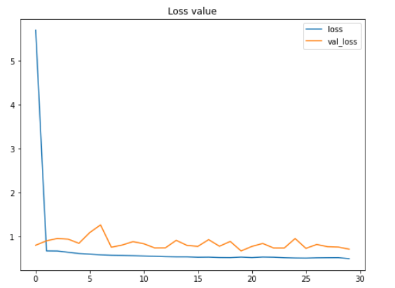
According to the two figures above, we can say that the performance of the model keeps improving, even though both the testing accuracy and loss value look fluctuating within this 30 epochs. Another important thing to notice here is that this model does not suffer from overfitting thanks to the data augmentation method we applied in the earlier part of this project. We can see here that the accuracy on train and test data are 79% and 80% respectively at the final iteration.
Fun fact: before implementing data augmentation method, I got 100% accuracy on train data and 64% on test data, which is extremely overfitting. So we can clearly see here that augmenting train data is very effective to both improve test accuracy score while at the same time also reduces overfitting.
Model evaluation
Now let’s deep dive into the accuracy towards test data using confusion matrix. First, we need to predict all the X_test and convert the result back from one-hot format to its actual categorical label.
predictions = model.predict(X_test)
predictions = one_hot_encoder.inverse_transform(predictions)
Next, we can employ confusion_matrix() function like this:
cm = confusion_matrix(y_test, predictions)
It’s important to pay attention that the arguments used in the function is (actual, predicted) — not the other way around. The return value of this confusion matrix function is a 2-dimensional array which stores the prediction distributions. In order to make the matrix easier to interpret, we can just display it using heatmap() function coming from Seaborn module. By the way the values of classnames list here is taken based on the sequence returned by one_hot_encoder.categories_ — yes with that underscore suffix.
classnames = ['bacteria', 'normal', 'virus']
plt.figure(figsize=(8,8))
plt.title('Confusion matrix')
sns.heatmap(cm, cbar=False, xticklabels=classnames, yticklabels=classnames, fmt='d', annot=True, cmap=plt.cm.Blues)
plt.xlabel('Predicted')
plt.ylabel('Actual')
plt.show()
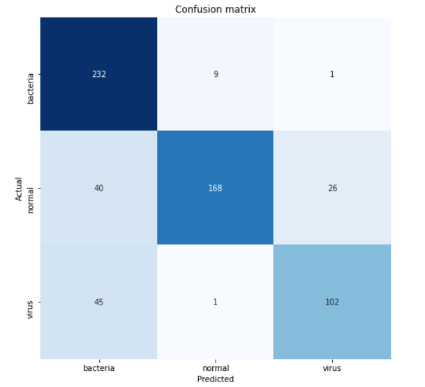
According to the confusion matrix above, we can see that 45 virus x-ray images are predicted as bacteria. This is probably because the two pneumonia types are quite difficult to distinguish. But well, at least our model is able to predict pneumonia caused by bacteria pretty well since 232 out of 242 samples are classified correctly.
That’s all of this project! Thanks for reading! Below is all the code you need to run the entire project.
References
Pneumonia detection on chest X-ray Accuracy ~92% by Jędrzej Dudzicz. https://www.kaggle.com/jedrzejdudzicz/pneumonia-detection-on-chest-x-ray-accuracy-92
Keras ImageDataGenerator and Data Augmentation by Adrian Rosebrock. https://www.pyimagesearch.com/2019/07/08/keras-imagedatagenerator-and-data-augmentation/
Pneumonia Detection using CNN was originally published in Becoming Human: Artificial Intelligence Magazine on Medium, where people are continuing the conversation by highlighting and responding to this story.
Via https://becominghuman.ai/pneumonia-detection-using-cnn-ac52873a2d1e?source=rss—-5e5bef33608a—4
source https://365datascience.weebly.com/the-best-data-science-blog-2020/pneumonia-detection-using-cnn
