
Do you know that your brain rewires itself all the time so you can learn new things?
Continue reading on Becoming Human: Artificial Intelligence Magazine »
365 Data Science is an online educational career website that offers the incredible opportunity to find your way into the data science world no matter your previous knowledge and experience.
Do you know that your brain rewires itself all the time so you can learn new things?
Continue reading on Becoming Human: Artificial Intelligence Magazine »

When travel is restricted, schools closed, businesses shut down, and communities put into quarantine, people lose income, employment, and access to healthcare and food.
While enforcing these lockdowns, are Government policies around the world taking into account the poorest and the most vulnerable?
$In the first three weeks of the lockdown domestic abuse killings in the UK more than doubled [1], Childline India helpline received more than 92,000 SOS calls asking for protection from abuse and violence in 11 day which is an increase by 50%[2], Lebanon and Malaysia, for example, have seen the number of calls to helplines double, compared with the same month last year; in China, they have tripled, in France increase by a third [3]
“ It heightened the danger for women forced to stay at home with their abusers. Children are now even more exposed to trauma.” [4]
120 Million poor kids get their midday meal in India alone from their schools. This is often the only source of healthy food for those children. Closing schools will deny these children access to food. Feeding children that usually would get their lunch at school is also a problem in developed countries. For example, US food banks have seen a huge spike in need and estimate it will need an additional $1.4 billion to meet increased needs over the next six months [5].
During Ebola, it was seen that there was an increase in forced child marriage[6]. The same is expected during the Coronavirus lockdown.
Those are only a few examples out of many devastating consequences.
Looking at all the above, the question arises if government policies are inclusive and take into account the poor and vulnerable?
‘If you don’t address poverty, you can’t stop the virus,’
‘It’s almost as if some people think they can put a fence around the groups they left out’
‘Even when we take the rich countries, poor people know from history that every time there is some great struggle, whether it’s the Great War, or the Spanish flu, or the recession of 2008, they are hit the hardest’. [7]
Government policies cannot just look at stopping the spread of the virus but also have to look at how policies will directly impact people who are most vulnerable. There may be a fundamental problem in the current form of governance, which is top-down and lacks the ability to see the full picture.
‘The central planner is unable to obtain all the necessary information to organize society in this way, as information has subjective, creative, dispersed, and tacit qualities’ [8]
To solve the current crisis (health, economic, humanitarian), we need a global collaborative effort that is sadly missing.
‘Be the change you want to see in the world’ — Mahatma Gandhi.
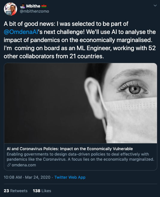
We gathered a group of 70 data scientists, AI/ML experts, and domain experts from all over the world and across 6 continents. The experts are working (or worked) at the World Health Organization, The World Bank, European Commission, and UNICEF USA.
And the enthusiasm was clearly visible.
‘…remember that the same technology can usually be used not only by governments to monitor individuals — but also by individuals to monitor governments.’ — Yuval Noah Harari [9]
We have identified vulnerable populations based on the following criteria:
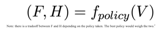
We then created a Mathematical Formulation:
V — vulnerable populations (e.g. population weighted by poverty or accessibility index)
f(policy): impact of policy
F — resulting in the financial state of a vulnerable population (e.g. has job / daily earning)
H — resulting in the health state of a vulnerable population (e.g. COVID 19 — deaths/infections)
We broke down the problem into multiple tasks, below are some of the results (we will publish all the results at the end of May).
task-managed by Alan Ionita
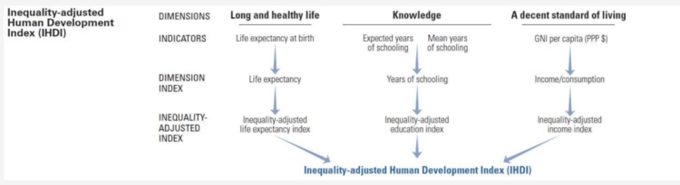
We are looking at different countries based on metrics like UN income classification, the Human Development Index, and the Inequality-adjusted Human Development Index (IHDI).
task-managed by Rohet Sareen
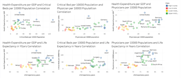
The data consisted of aggregated features related to Access to Health care facilities for certain countries. Features like Health Expenditure, Critical Beds, Physicians as well as Income Class of Country ( as per GDP) were used to account for each country’s healthcare using a variety of data sources.
1. How To Choose Between Angular And React For Your Next Project
4. Tutorial: Stereo 3D reconstruction with openCV using an iPhone camera
The key objective was to get a cluster of countries having similar health care facilities which can then propagate the task of policy building for the health-care domain. K-Means Clustering Method was used along with a Principal Component Analysis (PCA) Method to map it on a 2-D graph as shown below.
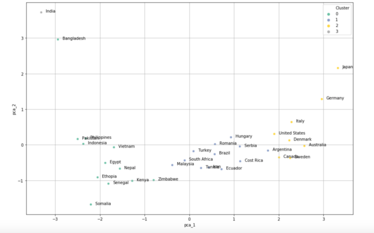
As we can infer from the graph that, certain countries sharing similar demographics and economic condition were clustered together.
The next step is to study each cluster and refine the model using different approaches and tuning the parameters.
task-managed by Elke Klaassen
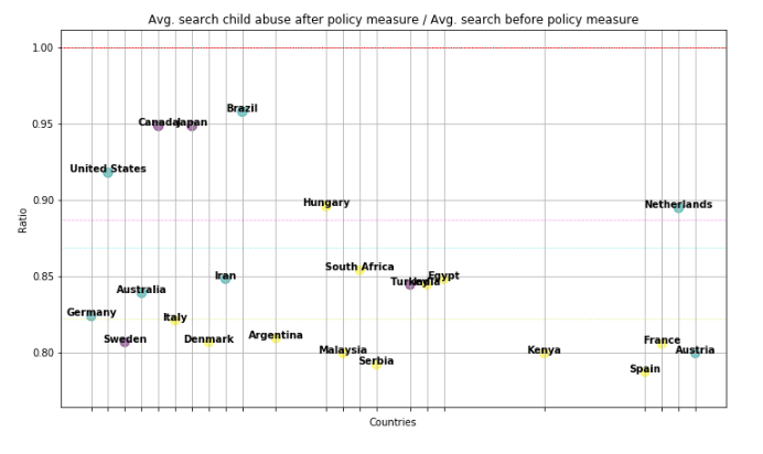
We also looked at the average search for child abuse and domestic violence after and before policy.

task managed by Baidurja ‘Adi’ Ray
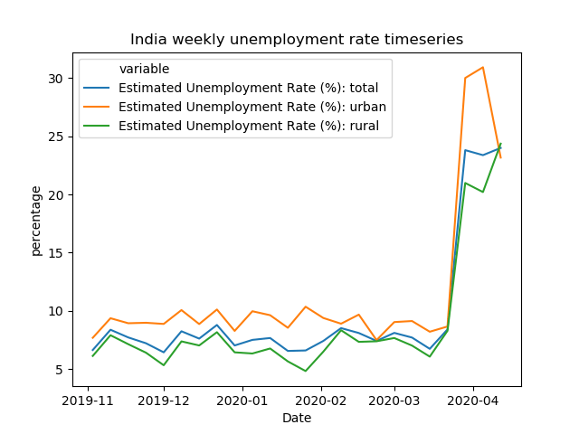
In India, we see a somewhat bigger rise in unemployment (percentwise) for the urban region compared to the rest of the country but recently came back down — perhaps due to migration.
task manager by Kritika Rupauliha
This is an ongoing work and above are only some of the results. At the end of May, we will publish all results including co-relation models.
In these difficult times, we are optimistic about the future. We want to work towards building a future where not only the rich and powerful have a say but everyone’s voice is taken into account. A world that is driven by empathy and care for everyone and where a global community using advanced technologies like AI solves real-world problems for the people, by the people.
In conclusion, a quote that I will remind everyone at this time:
“Any society that would give up a little liberty to gain a little security will deserve neither and lose both” — Benjamin Franklin
This project was done via Omdena — an innovation platform for building AI solutions to real-world problems through the power of bottom-up collaboration.
I would like to thank Mauricio Calderon Chris P. Lara Neeraj Mistry Branka Panic Virginie MARTINS de NOBREGA for expert advice.
Here are some of the collaborators in this project (in alphabetical order):
Aaron Ferber, Ajaykumar G P Palaniswamy, Alan Ionita, Albina Latifi, Anis Ismail, Anju Mercian, Arthur Wandzel, Baidurja Ray, Bushra Akram, Cesar Velásquez, Elke Klaassen, Farhad Sadeghlo, Hassan Shallal, Hunar Batra, Kritika Rupauliha, Kunal Sinha, Kushal Vala, Magdalena Kalbarczyk, Mbithe Nzomo, Mircea Ioan Calincan, Mohammed Ba Salem, Nikhel Gupta, Nikolaus Siauw, Reem Mahmoud, Rohet Sareen, Sanchit Bhavsar, Shubham Mahajan, Sridatt More, Yash Bangera.

[1] https://kareningalasmith.com/2020/04/14/2020/
[4] https://www.bbc.com/news/world-europe-52216966
[5] https://www.cbsnews.com/news/coronavirus-pandemic-food-banks-us-unemployment-new-orleans/
[6] https://www.thenewhumanitarian.org/fr/node/255080
[7] https://www.nytimes.com/2020/04/10/magazine/coronavirus-economy-debate.html
[8] https://fee.org/articles/why-taiwan-hasnt-shut-down-its-economy/
[9] https://amp-ft-com.cdn.ampproject.org/c/s/amp.ft.com/content/19d90308-6858-11ea-a3c9-1fe6fedcca75


How Artificial Intelligence can help Vulnerable Populations during Pandemics was originally published in Becoming Human: Artificial Intelligence Magazine on Medium, where people are continuing the conversation by highlighting and responding to this story.
Artificial intelligence and big data are two of the most important terms that the world is talking about. There is a lot of development taking place in this field and are paving the way for new inventions that are making life simpler and task completion with fewer flaws and errors. When it comes to its usage, then Artificial intelligence is not a new term, instead it has been existence for a long time. It’s only in the last few years that we have seen some significant developments in this field.
If we are talking about Artificial Intelligence, then it is incomplete without data. In fact, data forms the basis of the successful functioning of AI. So, how are these two interrelated, and what does it hold for the future. Any kind of technology is incomplete without the support of its area expert. The similar applies to big data and AI; you would need the help of artificial intelligence developer and prominent data experts. They work towards implementing the best practices of both these technologies and ensuring the successful execution of the program.
When we talk about the relationship between these two, then AI and big data share a reciprocal relationship. Both these work together to explore what the data has stored in for them and use it to the fullest potential such that it helps the organization making the best use of the same.
Today every organization needs data; this data forms the basis for various work and formulating strategies of growth for the organization. Hence, careful and apt assessment of data and using the inferences to formulate strategies.
Well, these are some of the few ways in which AI can strengthen Big Data. Both these technologies are there to stay and thus paving the way for new career avenues. We cannot undermine the fact that we need technological advancement to ensure that the business grows and also come up with tools that will eventually help in simplifying people’s lives. AI and Big Data are going to be the underpinning of growth for any organization.
1. How To Choose Between Angular And React For Your Next Project
4. Tutorial: Stereo 3D reconstruction with openCV using an iPhone camera
However, there is still a lack of necessary skills and workforce that can efficiently use this technology, thereby ensuring the right use and assessment. It has led to a rise in demand for big data certifications and artificial intelligence certification. These certification programs are designed to help the learner get complete knowledge about AI and Big Data.
Global Tech Council is a leading name when it comes to the best big data certification online programs. This online certification program has been developed to help the students get all the knowledge about big data and various techniques and methodologies that are used in Big Data. The platform also provides artificial intelligence training that will help you understand how big data and AI are interrelated. The online training program offers a blend of both classroom and practical learning experiences. So, if you wish to become a big data expert or artificial intelligence developer, this certification is the right choice.
When Artificial Intelligence Meets Big Data was originally published in Becoming Human: Artificial Intelligence Magazine on Medium, where people are continuing the conversation by highlighting and responding to this story.
Originally from KDnuggets https://ift.tt/2YHhvv1
source https://365datascience.weebly.com/the-best-data-science-blog-2020/chatbots-in-a-nutshell
Originally from KDnuggets https://ift.tt/2yyTV8Y
Why GGPlot2 Scatter Plot?
Data visualization is one of the most important steps in data analysis. It helps us gain insight from the data, which would be hard-gained with data as pure numbers. One of the major advantages of visualizing data is that we can relay our findings to an audience, irrelevant to its members’ technical expertise.
As for which environment we choose for data visualization, there is no shortage of available options. From high-level software Tableau and Power BI to leveraging the data viz properties of data science programming languages such as Python and R.
Though overshadowed in recent years by Python, R remains one of the most important tools in data science-related fields, and especially in statistics related professions. Which is why we choose to dedicate this tutorial to charts with none other the R programming language.
ggplot2 is a data visualization package, created by Hadley Wickam in 2005. It relies on a concept known as the grammar of graphics, which is a set of rules for dividing each plot into components or layers.
But hold on Python users, don’t go anywhere! Due to its overall popularity, there is even a ggplot package available in Python. Here, it’s important to note, that ggplot is closely related to pandas. So, you might wish to store your data as a pandas data frame when using ggplot in Python.
This also means, that once you’ve become a master of ggplot, you’d be able to conjure up plots in both R and Python! Killing two birds with one stone. So, let’s dive straight into ggplot and introduce the grammar of graphics!
The ‘grammar of graphics’ is the basis for how each GG plot is created. You can think of it as a way of dividing each plot into layers, where each layer is responsible for a specific element of the chart. There are seven layers we can use when creating a ‘GG plot’.
So, below, I’ll give you an overview of each of these 7 layers that constitute the ‘grammar of graphics’. Then, to put what you’ve learned into practice, I’ll show you how to create your very own scatter plot using a ggplot.
First, to the ggplot2 layers: The first three layers are mandatory, while the remaining four are optional.
Let’s start with the first layer, also known as the data layer. Creating a chart, naturally, means we require some data. Otherwise, our chart wouldn’t have anything to display. Therefore, it is only logical that data is the first and most important layer.
Next, we must decide how the data will be visually organized onto different axes. This is where the second layer comes in: it is called the aesthetics layer. Here we specify the mapping to the x and y axes.
The last required layer is the geometry layer. Through geometry, we specify what shape our data will take. In other words, will the points take the form of bars, circles, dots, etc?
These three layers alone are all it takes to create a chart in R. The remaining four layers are optional. However, if you’d like to be proficient at visualizing data in R, it pays off to master them, too!
For the first three layers, we must start with data, continue with aesthetics and, as a third step, determine the geometries.
The remaining four layers don’t need to appear in strict order. In fact, we don’t have to include any of them in our plot, hence the optional part.
In this tutorial, we list the optional layers in a specific order simply for convenience. But it is not necessarily the order in which they should appear in a ‘GG plot’.
With that in mind, let’s continue with the fourth layer: the ‘Facets’ layer. The ‘Facets’ layer enables us to split our visualization into subplots, according to a categorical variable or variables. Subsequently, each subplot corresponds to a subset of categories of the variables. For instance, say we have an engine type variable in our data, containing diesel, petrol, and electric engine cars. Using the ‘facets’ layer would allow us to divide our data set into three plots, each containing one of the three categories:
Moving on to the fifth layer which is: ‘Statistics’. This layer represents the statistical transformations we might perform on our data. It can be used for various purposes, such as determining the number of bins when plotting a histogram or smoothing lines when drawing a regression line.
The sixth layer is the ‘Coordinates’ layer. The coordinates layer, as the name suggests, is connected to the coordinates or boundaries of our graphs. This layer can be used to zoom in or out of a plot. Apart from this, it could be used to perform transformations on the coordinate system – for instance, switch to polar coordinates.
Finally, we arrive at the seventh layer: ‘Themes’. The ‘Themes layer’ has a sole purpose – to polish the appearance of our plot. This is the place that controls the overall style of our graph. For instance, we can choose from darker or lighter themes. Not only that, with the aid of the ‘themes’ layer we can use predefined templates or recreate the visuals and style of well-known publications such as the BBC or the Economist, among others.
And that’s all the seven layers of a ggplot!
Alright, so far, this all has been theoretical. But we’re ready to proceed with a practical example. Next up, you’ll learn how to implore your newly gained knowledge to create your very own ggplot2 scatter plot.
We’ll be using ‘GG plot 2’ – one of the most popular visualization libraries in R.
To use a library in R, we need to include it in our script. We achieve it by writing ‘library’. Then, in the round brackets include the name of the library, in our case ‘GG Plot 2’.
![]()
Next, you’d need some data. In this example, we’re using a data set, containing information on California real estate.

Of course, you can use your data for plotting. Once you have it, you require the ggplot function. For a complete plot, we require all three mandatory layers.
Nonetheless, as this is an introductory tutorial, let’s examine where acquiring each individual layer gets us. We begin with:


And that’s all you need to make a ggplot2 scatter plot. For more awesome tips and tricks, you should most definitely check out the ggplot2 cheat sheet. It is a superb resource!
You already have the tools necessary to make a gg plot2 scatter plot. But this tutorial is only the beginning. R programming and the ggplot2 library offer a variety of options for visualizing and styling exceptional charts. We encourage you to explore the ggplot package on your own and try your hand at crafting ggplots. Bet you’ll come up with some great ideas!
Check out the complete Data Science Program today. Start with the fundamentals with our Statistics, Maths, and Excel courses. Build up a step-by-step experience with SQL, Python, R, Power BI, and Tableau. And upgrade your skillset with Machine Learning, Deep Learning, Credit Risk Modeling, Time Series Analysis, and Customer Analytics in Python. Still not sure you want to turn your interest in data science into a career? You can explore the curriculum or sign up 12 hours of beginner to advanced video content for free by clicking on the button below.
The post How To Make a GGPlot2 Scatter Plot in R? appeared first on 365 Data Science.
from 365 Data Science https://ift.tt/2W9QnD4
Originally from KDnuggets https://ift.tt/35DjKRr
Originally from KDnuggets https://ift.tt/2SH3Wbk

There is no day in the life of an engineer without resolving problems. Often, we, as engineers, focus on building new tools or delivering increased performance of an existing function (usually ten-folds). This focus on the new and cool is great in the fast paced areas of emerging business lines.
However, once we develop a business function or a capability, we need to quickly operationalize it and optimize it to function well. When things go wrong with that operational business function, we need to quickly identify the underlying problems and correct them to avoid wasting time and money that adds no value to the platform users.
In the end, if we can’t deliver on our basic processes, no one will trust us with anything else. This is where problem management is crucially important. Here are the 5 basic steps of problem management:
The first step in solving problems is realizing you have a problem. Problem consciousness is really important. In the early stages of problem management, problems are everywhere. There is typically little effort required to find something broken and attempt to fix it. Some organizations use an incident management function to feed their problem management process. They review and postmortem every major incident to find problems, expose their root cause, and drive organizational change to fix them. Other problems are harder to find when the systems and volumes of incidents become more complex.
Some operational entities for instance, perform about 400,000 server repairs a year. These repairs come in the form of server repair tickets. Often, the tickets are driven by various factors like component quality, software tooling, software automation, or even transactional defects. It is challenging to spot the systemic problems when they are buried in a sea of data.
Once a problem is detected, one needs to quickly categorize it to help understand its significance and the appropriate urgency required to resolve it.
A few basic categorizations of a problem include:
Once you have the problem adequately categorized, move on to the next phase.
1. Paper repro: “Learning to Learn by Gradient Descent by Gradient Descent”
2. Reinforcement Learning for Autonomous Vehicle Route Optimisation
4. AI, Machine Learning, & Deep Learning Explained in 5 Minutes
In this phase of the problem management process, one needs to dig deep into the problem to identify the root causes. This often requires some form of a root cause analysis process to be followed. There are all kinds of processes for this step:
The key is to make sure your approach is systematic and thorough. Separate the symptoms of the problem from the root causes of the symptoms. Improperly identifying and treating a symptom of the problem will not fix the problem — just mask it. Once you know the root causes of the problem — put a fix(s) in to correct them.
Some organizations go further to define counter measures (CM) to contain the spread of a problem. Engineers often call these counter measures things like approved exceptions, work arounds, etc. Think of these counter measures as a cone in the road to alert you to a pothole. Also, some organizations define corrective actions or long-term corrective actions (LTCA) to define the steps required to fix the root causes. Think of this as a paving crew resurfacing that road with the pothole mentioned.
In this phase of problem management, we go back to the basics of middle school science class, The Scientific Method. It has been a basis of all science since the 17th century. We know it works.
The Scientific Method steps:
Rinse and Repeat this cycle until you have identified and implemented all of the required changes to properly address the root causes of the problem.
Granted, we don’t always need to follow the scientific method if the fix is obvious. Some fixes are super obvious and easy to measure for success.
Don’t be in a hurry to make changes and close a problem until you absolutely know with confidence that the problem is resolved. Prematurely resolving a problem will only yield new problems which will need to be researched. Also, you will lose credibility that you can solve problems if your investigations fail to address the root causes.
Run a postmortem on the problem investigation. This can be helpful to guide and develop organizational learning. Keep track of your problem investigations over time. Data regarding these efforts can help continuously improve organizations.
That’s pretty much it. Good luck investigating problems. If you have any feedback or suggestions to improve this note, please share.
How to Deal with Engineer’s Pain Points was originally published in Becoming Human: Artificial Intelligence Magazine on Medium, where people are continuing the conversation by highlighting and responding to this story.

Front-end has been one of the most dynamically evolving directions in nowadays development. That’s why the great variety of tools, libraries, and frameworks elaborated to ease the working process, doesn’t knock our socks off. But that’s also the reason for another problem: which one between them to choose?
Today we will shed light on the most popular JavaScript frameworks for front-end developers, React and Angular.
Angular is a JavaScript framework elaborated by Google and written in TypeScript. The latest updates of Angular were released in August 2019.
React is a JavaScript library for UI development managed by Facebook, updated in August 2019.
Though both frameworks guarantee you easy modification, while concerning the speed of application development, you should take into account the skills of developers and the number of libraries with the functionalities available. React’s architecture is easier than Angular’s but developing an app in Angular is faster than in React.
Angular. Being developed by Microsoft, and influenced by Java and .NET, Typescript features extremely strong typing system able to statically analyze code by using a combination of annotations and type inference, making learning easier for developers who have previously worked with one of these languages.
React. React combined markup and logic using an XML-like language that allows writing markup directly in JavaScript code. The biggest advantage of JSX remains its static analysis that immediately emits errors.
Mastering Angular is much more time-consuming than mastering React. It’s a complete framework that requires learning associated concepts like MVC and TypeScript. Though, the time spent on learning will definitely be paid back in understanding how the front-end works. In comparison to Angular, React is not a complete framework, and its usage requires the use of third-party libraries. It offers a guide that acquaints you with basics just in one hour. The only thing that might cause difficulty while mastering React is Redux Library, as about 60% of React-built applications use it.
Angular and React take dramatically different approaches to update HTML which affects the performance of an application.
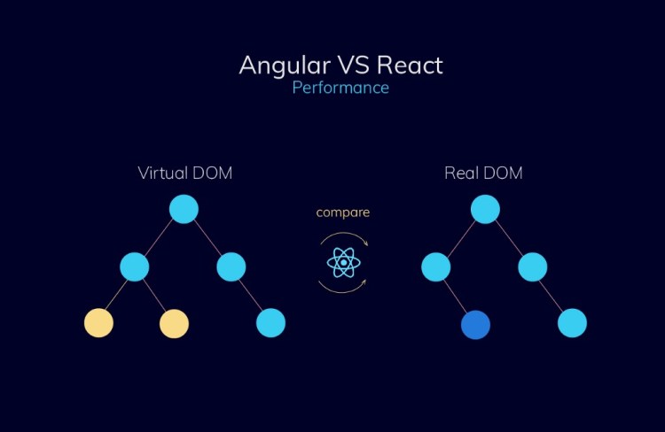
Angular utilizes Regular DOM which uses change detection to find which component needs updates. Even if the changes take place in one element, it updates the whole structure. React uses a Virtual DOM that helps to increase general speed and application’s performance. When one change is done, it updates only specific elements and doesn’t influence the other parts. It’s considered to be faster than Regular DOM.
1. Paper repro: “Learning to Learn by Gradient Descent by Gradient Descent”
2. Reinforcement Learning for Autonomous Vehicle Route Optimisation
4. AI, Machine Learning, & Deep Learning Explained in 5 Minutes
The structure of Angular is stable and complex formed on three layers: Model, Controller, and View. Reusable Angular components are written in four separate files: a TypeScript, an HTML file, a CSS file and a file for testing.
React’s structure gives complete freedom of choice. Though, at the beginning of each project, you have to design the app structure. React provides only View layer and two others must be added from other libraries. React’s app is based on components directed in functional and class-based ways.
While testing Angular projects, two frameworks Jasmine and Karma can be used and both of them fit very well. Jasmine guarantees human-readable test cases, whereas, Karma allows running the test cases on every browser and platform configured.
React applications are tested through Jest (a test runner), assertion and mocking library. It is often used in combination with Enzyme that adds extra functionality to the test.

According to the survey held by StackOverflow, 67% of programmers prefer React, whereas, 42% vote for Angular. The tremendous popularity of React can be explained by its usage in such upmarket projects as Instagram and Facebook. Yet, it’s better to try once yourself than to judge someone’s experience.
Regulating the size of the app and keeping it compact is the best choice, as all the necessary parts of MVP are held in Angular. That allows producing a fully functional Single-page application.
If you are planning to expand the app across multiple operating systems, React is definitely your cup of tea.
So who is the winner in this battle? Each of the frameworks has its benefits and drawbacks, of course, but our message is to pick the one that is easier to master for your team of programmers.
Angular vs React what to choose in 2020? was originally published in Becoming Human: Artificial Intelligence Magazine on Medium, where people are continuing the conversation by highlighting and responding to this story.
