Compile your C/C++ code in windows using vs code
Continue reading on Becoming Human: Artificial Intelligence Magazine »

365 Data Science is an online educational career website that offers the incredible opportunity to find your way into the data science world no matter your previous knowledge and experience.
Compile your C/C++ code in windows using vs code
Continue reading on Becoming Human: Artificial Intelligence Magazine »
Originally from KDnuggets https://ift.tt/32eZSUr
Originally from KDnuggets https://ift.tt/2Jz66rv
Originally from KDnuggets https://ift.tt/2Jwggcp

Predicting whether or not a person is able to repay their loan might be kinda important for lenders. Here’s actually where machine learning comes into the game. In this article, I would like to share my experience of employing LightGBM algorithm to complete this task. But before that, I will let you know that this article is going to be broken down into several parts:
First off, let’s talk about the data. Here we are going to use Home Credit Default Risk dataset which you can download it from here [1]. The entire dataset itself is basically only consists of tabular data (csv), yet the size is as huge as 2.5 GB. Please note that there is no image or long text appears in the table, so everything is purely made of customer data!

All the data are distributed in several different csv files, where the parent of all of these is application_{train|test}.csv. The structure of the entire dataset is displayed in figure 1. If you have ever learned about relational database schema then this chart should be easy to comprehend.

Fortunately, according to my short data exploration, I found that application_train.csv has been pretty complete as it itself consists of 122 unique columns. This basically says that every single person can be described with 122 features, which is to me it is more than enough for a machine learning algorithm to find pattern in the data. Since the application_test.csv does not mention the sample labels, thus, I decided to take only the train file for both training and validating purpose.
Alright, so let’s actually get into the code to perform a little EDA on this dataset. Before doing anything with the code, we need to import all the required modules and the dataset first.
Now if we try to take the shape attribute of this data frame, then we should obtain the following output:
In:
df.shape
Out:
(307511, 122)
The result above basically tells us that the we got around 300,000 number of samples where each of those are having 122 attributes. By running df.head(), we will see how the first 5 data samples look like.
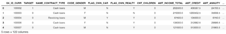
It looks like some of the column names are self-explanatory, but believe me, if you scroll all the way to the right you will see more columns where the names are not quite straightforward. Therefore, here I decided to take only some of those columns into account.
1. Fundamentals of AI, ML and Deep Learning for Product Managers
3. Graph Neural Network for 3D Object Detection in a Point Cloud
4. Know the biggest Notable difference between AI vs. Machine Learning
It’s important to know that the label of each data is stored in TARGET column. Now we will see how the data distribution looks like just to check the number of samples of each class. The code in figure 4 below is used to create a graph drawn in figure 5.
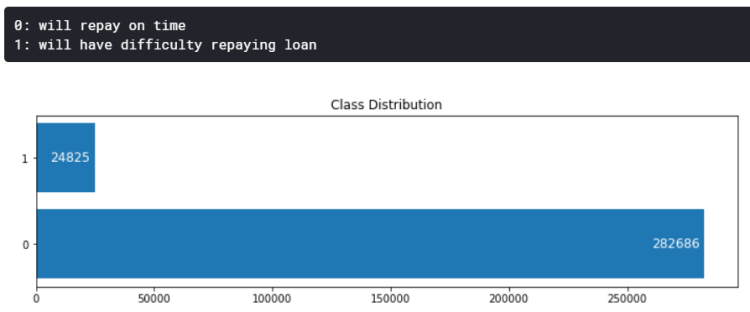
According to the output above, it is known that the dataset is extremely unbalanced. I will also discuss more about this data distribution in the next section of this writing.
Next up, let’s look at the values of DAYS_BIRTH column. Here’s the code to do so:
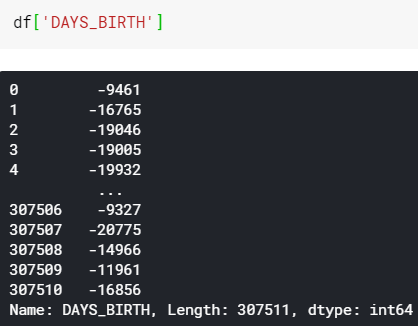
We can see here that all these numbers are basically just customers’ age, yet it’s stored in form of negative days. In fact, DAYS_EMPLOYED column also contains the similar values. I am not sure why Home Credit stores these values that way, but I will just fix it anyway. The code is shown in figure 7 below.
After all age values have been fixed, we can now create a KDE (Kernel Density Estimate) plot to find out the customer age distribution. The implementation is pretty simple that we can just use kdeplot() function taken from Seaborn module (figure 8).

Interpreting the above graph is pretty simple. We can see here that most of people who have difficulty to repay their loan (target=1) is distributed at around 30s years old. The trend of the blue graph is actually getting lower as the age increases. This basically says that younger people is less likely to be able to repay their loan in time. In fact, such finding in age distribution might be becoming one of the most important features for training a machine learning model.
After taking a glance at each column names and values, now I decided to take only several of those to be used as the feature vector — like I’ve mentioned earlier.— The code shown in figure 10 below displays how I create another data frame (reduced_df) which consists of only several columns of the original data frame.
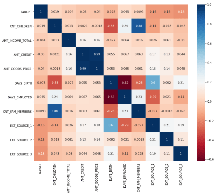
A little analysis towards this smaller data frame can also be done. The code shown in figure 11 displays how I construct a correlation matrix in which the output is shown in figure 12. The cell values of the matrix should essentially be in the range of -1 to 1 (inclusive), where the correlation of 1 means “when x is high, then the value of y is high as well”. On the other hand, negative correlation says “when x is high, then y is low”. The figure 12 below shows that positive correlations are highlighted in blue, while the colors are gradually changing to red as the score approaches -1. Also, when the correlation score is around 0, it means that the two variables are not correlated to each other. For example, CNT_CHILDREN has positive correlation with CNT_FAM_MEMBERS with the score of 0.88. This basically says that someone who have more children tends to have more family members. And well, this is absolutely making sense.
Actually, there are still plenty of things that we can find out by performing similar analyses on the data frame. However though, I am not going to display all of them since it will make this article extremely long.
Now let’s jump to another chapter: feature engineering.
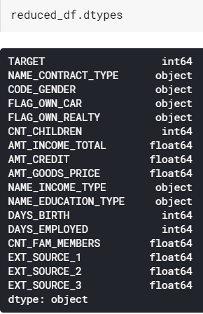
Feature engineering is usually the longest process that we need to do in order to create a machine learning model. Now I would like to start this part with finding out the datatypes of each column which the output can be seen in figure 13.
Notice that some of the columns in our data frame are still in form of object. In Pandas, object simply means string. This is actually a problem since basically any machine learning algorithm will work only with numerical data. Hence, we need to either label-encode or one-hot-encode all these objects.
To determine whether we should use label encoder or one-hot encoder, we need to find out the number of unique values in each of those columns first. If a column has more than 2 categories, then we need to use one-hot encoder. Otherwise, if the number of categories is exactly 2 we need to use label encoder instead. In order to do that, I decided to create a simple loop which is going to print out the number of unique value in each of the columns in reduced_df.
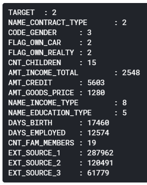
Pardon the weird indentation 🙂 We can see here that CODE_GENDER, NAME_INCOME_TYPE and NAME_EDUCATION_TYPE are having more than 2 unique categorical values. Hence, we need to convert these into one-hot format. My approach here is to employ get_dummies() function taken from Pandas library.
Initially, the shape of reduced_df is (307511, 17), where 17 indicates the number of existing columns. Subsequently, after running the code in figure 15 above, the data frame should now be having the size of (307511, 30). This number of column is taken from 17 (initial) + 3 (code gender) + 8 (income type) + 5 (education type) – 3 (no of columns converted to one-hot) = 30 (final result).
Next, we need to perform label encoding to the columns where the number of unique values are exactly 2. This can be achieved by using LabelEncoder object from Sklearn module. The complete process is done in figure 16. Additionally, notice that here I am using 3 different label encoders for the 3 columns.
Alright, up to this point we already created features in which all of those are in form of non-string data. Now if you check the datatypes of all columns in the data frame like what I did in figure 13 above you should see that everything has been in form of either integer or float. And this is exactly what we want.
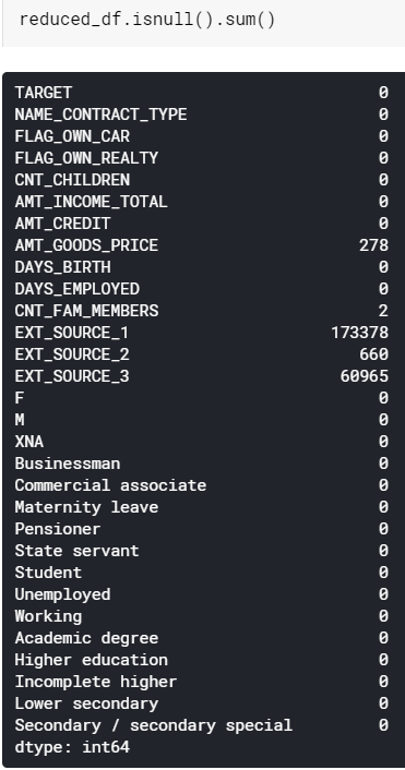
However though, we still encounter another problem. What’s that? Look at the figure 17. All values displayed here basically denotes the number of missing values in the corresponding column. There are actually 2 options to choose here, either dropping all those NaN values or filling them with a particular number.
In this case, I decided to fill them all using the average value of each column for some reasons. In fact, you may try to use median, zeros, or probably forward fill in order to do so. Yet I feel like taking the mean value is just the right choice.
The implementation itself is pretty simple thanks to fillna() method which can directly be applied to the columns. The detailed steps is shown in figure 18.
And that’s the end of feature engineering chapter! Now let’s continue creating the machine learning model in the next section!
Before the model is trained, we need to split the data into train and test in advance. This is going to be useful to find out whether our final model suffers overfitting. To do so, we are going to employ train_test_split() function taken from Sklearn module.
The very last step before training is value normalization. This step is useful to make our classifier being able to distinguish the features between different classes better. A medium article [2] shows the significant performance improvement after employing normalization method to the data. In order to do that, my approach here is to use MinMaxScaler() which is also taken from Sklearn library. After we run the code in figure 20 below, all values in our dataset will lie within the range of 0 to 1 (inclusive).
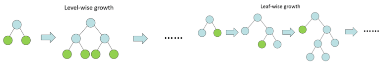
Finally, it’s time to initialize the model! As I’ve mentioned in the title of this article, here we are going to use LightGBM to perform the classification task. LightGBM is a relatively new machine learning algorithm since it was just released back in 2016 by Microsoft [3]. According to [4], it is a kind of tree-based algorithm which grows leaf-wise instead of level-wise.
LightGBM gets its popularity due to its high speed and its ability to handle large amount of data with low space complexity. However though, we can not apply this algorithm in every classification task since it commonly performs best when the number of available data is 10,000 or more [4]. That’s basically all the fundamental that we need to know about LightGBM, now let’s start to actually implement the algorithm to our case.
We can see the figure 22 below that the implementation is pretty simple thanks to the presence of LGBMClassifier object which can simply be taken from LightGBM module. In fact, this classifier contains plenty of adjustable parameters, yet here I decided to only pass 3 of those to make things simpler.
The first parameter here is n_estimators which I set the value to 100. This argument basically says that we are going to fit 100 trees. Next up, the parameter of class_weight is set to balanced which is extremely necessary to be done since the data distribution between the two classes are unbalanced. Lastly, random_state is used just to make us being able to reproduce the exact same result in different runs.
Afterwards, the model is fitted by applying fit() method to the LightGBM model (line 3). The parameters to pass are actually almost the same as Keras or Sklearn models. But notice that here I use AUC (Area Under Curve) as the evaluation metric, which is I think it’s not as commonly used as accuracy score. We’ll get deeper into this after the training is done.
Below is how the training process looks like. We can see here that the AUC score is 0.78 and 0.73 towards train and test data respectively. It’s kinda overfitting, but I think it’s not a very bad one.

Mathematically speaking, AUC score is basically calculated based on ROC (Receiver Operating Characteristic) curve. Let me plot the graph first to make things clearer.
Alright, so the reason why ROC AUC is used in this case is because we are dealing with extremely unbalanced class distribution, where the number of samples of negative class is nearly 11.4 times greater than that of positive class.
Different to standard accuracy score, ROC curve is constructed based on the positive probability score of each sample instead of its rounded probability. That’s basically why we only take into account the second index of prob_train and prob_test in line 6 and 7 of figure 24. (Since the first index stores negative probability)

Now, we can see in the figure 25 above that the train ROC curve lies above the test curve, hence it’s straightforward why the blue curve produces higher AUC. Keep in mind that the green straight line is essentially used as the lower bound, meaning that if your train and test ROC is coincident with this straight line then we can simply conclude that the model is performing random guess instead of actually classifying the data samples.
Keep in mind that the ROC curve is constructed based on data points generated using roc_curve() function, and it is important to know that the area underneath the the curve is computed using different function, namely roc_auc_score(). The figure 26 below displays how to print out the AUC values, which the output is in fact exactly the same as what we obtained in the last training iteration (figure 23).
The final result that we just obtained is 78.0% and 73.0% towards train and test data respectively, where both of them are taken using ROC-AUC method. I am sure that this classification performance is still able to be improved. If we jump back to earlier sections of this writing, we can see that our data preprocessing is relatively simple: taking into account only several features which might look promising, encoding categorical data, and finally filling missing values with the mean of each column. It is probably worth trying to use the entire columns in the dataset so that the model is able to better catch the pattern in the data. Furthermore, the parameters that we passed to the LightGBM model is very simple. In fact, if we look at the documentation of LightGBM, we will see that there are tons of parameters to adjust which might also affect the final model performance. Therefore, according all to these facts, we can conclude that we still got room for improvements in this machine learning task by performing further feature engineering and hyperparameter tuning.
Hope you like this article! See you in the next one!
Note: the entire code used in this project is wrapped up below.
[1] Home Credit Default Risk. https://www.kaggle.com/c/home-credit-default-risk.
[2] Why Data Normalization is necessary for Machine Learning models by Urvashi Jaitley. https://medium.com/@urvashilluniya/why-data-normalization-is-necessary-for-machine-learning-models-681b65a05029#:~:text=Normalization%20is%20a%20technique%20often,dataset%20does%20not%20require%20normalization.
[3] LightGBM. https://en.wikipedia.org/wiki/LightGBM.
[4] What is LightGBM, How to implement it? How to fine tune the parameters? By Pushkar Mandot. https://medium.com/@pushkarmandot/https-medium-com-pushkarmandot-what-is-lightgbm-how-to-implement-it-how-to-fine-tune-the-parameters-60347819b7fc


LightGBM on Home Credit Default Risk Prediction was originally published in Becoming Human: Artificial Intelligence Magazine on Medium, where people are continuing the conversation by highlighting and responding to this story.
Matplotlib is an amazing visualization library in Python for 2D plots of arrays.
For using matplotlib in jupyter notebook, first, you need to import the matplotlib library.
In this blog post, I have discussed a list of 9 tips and tricks that you can use while working with matplotlib.
Originally Posted on my Website — Let’s Discuss Stuff
Tricks and Topics discussed in this blogpost:
Matplotlib contains an argument figsize inside the plt.figure() the command to change the figure size of the plot. You have to pass the value of x and y as values to the argument.
If you pass (7,5) as an argument then matplotlib will create a plot which is 7 inches in length and 5 inches in breadth.
You can also use dpi the argument to change the value of dots per inch of your plot. More dpi will make the plot make crisper. The default value of dpi is 100.
#first you need to import all the required libraries
import numpy as np
import pandas as pd
import matplotlib.pyplot as plt
import seaborn as sns
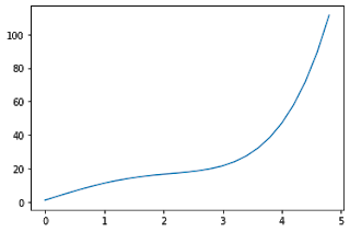
x = np.arange(0,5,0.2) # will create values from 0 to 5 at an interval of 0.2 each
y = np.exp(x) + 10*np.sin(x)
plt.plot(x,y)
x = np.arange(0,5,0.2)
y = np.exp(x) + 10*np.sin(x)
plt.figure(figsize = (6,4), dpi = 100)
plt.plot(x,y)

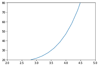
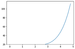
The functions xlim() and ylim() are used to set the axis limits for the x-axis and y-axis respectively. You have to pass the minimum value and maximum value as an argument to the function.
x = np.arange(0,5,0.2)
y = np.exp(x) + 10*np.sin(x)
plt.plot(x,y)
plt.xlim(2,5)
plt.ylim(20,80)
If you don’t want to specify both the minimum and maximum values, you can instead use top and bottom arguments in ylim() function to set the top limit and bottom limit respectively.
1. Fundamentals of AI, ML and Deep Learning for Product Managers
3. Graph Neural Network for 3D Object Detection in a Point Cloud
4. Know the biggest Notable difference between AI vs. Machine Learning
The other value will remain unchanged.
Similarly for xlim() function, you can set left and right value as arguments to set the left and right side limit of the plot.
x = np.arange(0,5,0.2)
y = np.exp(x) + 10*np.sin(x)
plt.plot(x,y)
plt.ylim(bottom = 20)
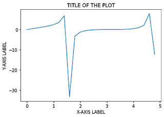
plt.title() – to set the title of the graph
plt.xlabel() – to set the x-axis label of the graph
plt.ylabel() – to set the y-axis label of the graph
Pass the titles and labels inside ” “double or single quotes.
x = np.arange(0,5,0.2)
y = np.tan(x) + np.sin(x)
plt.plot(x,y)
plt.title(" TITLE OF THE PLOT ")
plt.xlabel(" X-AXIS LABEL ")
plt.ylabel(" Y-AXIS LABEL ")
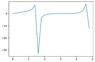
If you want to change the font of the title and labels, you can update the font using rcParams[font.family] and set the value to the respective font that you want to use.
plt.rcParams["font.family"] = "serif"
x = np.arange(0,5,0.2)
y = np.tan(x) + np.sin(x)
plt.plot(x,y)
plt.title(" TITLE OF THE PLOT ")
plt.xlabel(" X-AXIS LABEL ")
plt.ylabel(" Y-AXIS LABEL ")

plt.savefig() the function is used to download the graph you made. You need to mention the file name as an argument to the function.
The file will be downloaded in the directory in which you are running the program.
You can set many parameters like dpi, facecolor, edgecolor etc. inside the plt.savefig() function.
x = np.arange(0,5,0.2)
y = np.tan(x) + np.sin(x)
plt.plot(x,y)
plt.savefig("MYNEWPLOT.png")
plt.axhline() and plt.axvline() functions are used to plot a horizontal and vertical line respectively.
If you put plt.axhline(5) then it will just add a horizontal line at y=5.
Similarly for plt.axvline(5) then it will add a vertical line at x=5.
x = np.arange(0,5,0.2)
y = np.tan(x) + np.cos(x)
plt.plot(x,y)
plt.axvline(3,color='red')
plt.axhline(0,color='red')
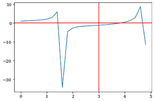
This will create horizontal and vertical lines ranging from maximum to minimum limit on both the x and y-axis.
If you want to set the lower and upper limit, use ymin and ymax as parameters to the plt.axvline() function.
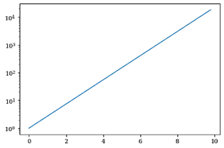
plt.yscale() the function is used to change the scale of the y-axis in matplotlib.
Set the argument to log in the plt.yscale() function to create a plot in a logscale.
x = np.arange(0,10,0.2)
y=np.exp(x)
plt.plot(x,y)
plt.yscale("log")
If you want to change the scale in x-axis, then use the plt.xscale() function.
y=np.arange(0,10,0.2)
x=np.exp(y)
plt.plot(x,y)
plt.xscale("log")

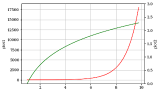
twinx() the function is used to do this in matplotlib.
You can represent 2 plots in the same graph, one on a normal scale and others on a different scale on both sides of the graph.
The x-axis autoscale setting will be inherited from the original Axes.
x = np.arange(1, 10, 0.2)
y1 = np.exp(x)
y2 = np.log(x)
fig, ax1 = plt.subplots()
ax1.set_ylabel('plot1')
ax1.plot(x, y1, color='red')
ax1.grid()
ax2 = ax1.twinx()
ax2.set_ylabel('plot2')
ax2.set_ylim(0,3)
ax2.plot(x, y2,color='green')
plt.show()
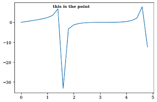
plt.text() the command is used to add text to a plot in matplotlib.
You need to add the text, x-axis, and y-axis value of the point where you need to add text annotation as arguments to the function.
You can also vary parameters like size, color and weight of the text annotation.
x = np.arange(0,5,0.2)
y = np.tan(x) + np.sin(x)
plt.plot(x,y)
plt.text(1.2, 7.5, "this is the point", weight = 'semibold')
Text(1.2, 7.5, 'this is the point')
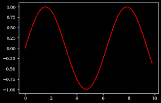
plt.style.use() the function is used to set the style of the plot in matplotlib. Like for dark style, use dark-background as an argument to the function.
plt.style.use("dark_background")
x = np.arange(0,10,0.2)
y=np.sin(x)
plt.plot(x,y,color='red')
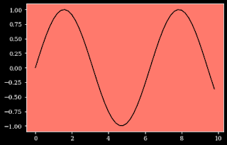
For changing the background color of the plot, you can use the ax.set_facecolor() function which the color as an argument to the function.
x = np.arange(0,10,0.2)
y=np.sin(x)
plt.plot(x,y,color='black')
ax=plt.gca()
ax.set_facecolor('xkcd:salmon')
Thanks for reading through the blog post. Make sure you like and subscribe to my website — Let’s Discuss Stuff if you want to get notified of future content. Consider checking out my other blog posts if you are interested in content like this.
9 Tips and Tricks for Better Visualization in Matplotlib was originally published in Becoming Human: Artificial Intelligence Magazine on Medium, where people are continuing the conversation by highlighting and responding to this story.
Originally from KDnuggets https://ift.tt/2HV10Wo
Originally from KDnuggets https://ift.tt/35YK8G2
Originally from KDnuggets https://ift.tt/3oYP1HJ
