Originally from KDnuggets https://ift.tt/3iZDYLl
source https://365datascience.weebly.com/the-best-data-science-blog-2020/7-signs-you-are-data-literate
365 Data Science is an online educational career website that offers the incredible opportunity to find your way into the data science world no matter your previous knowledge and experience.
Originally from KDnuggets https://ift.tt/3iZDYLl
source https://365datascience.weebly.com/the-best-data-science-blog-2020/7-signs-you-are-data-literate

Welcome to My Week in AI! Each week this blog will have the following parts:
This week I learned about big data engineering by starting the ‘Advance Your Skills as an Apache Spark Specialist’ learning pathway on LinkedIn Learning. I am somewhat familiar with Spark and Hadoop, but I wanted to learn more, and this seemed like a good way to gain those skills.
I also read a lot this week about data visualization in Python. I came across a powerful dashboarding library called Altair, which allows you to build very aesthetic dashboards and visualizations. It only requires Python knowledge and is based on visual grammar, so it is fairly intuitive. This is definitely a library I am going to add to my toolbox and explore further.
I spent another large part of my week brainstorming, researching, and writing a proposal for Etsy’s Summer of Vision Fellowship program. The assignment was to develop a machine learning project based on the question, “How might we use visual cues to improve buyers’ shopping experience on Etsy?” This prompted me to read a lot about recommendation systems, computer vision in e-commerce, and the use of computer vision and NLP in concert for such applications.
1. Natural Language Generation:
The Commercial State of the Art in 2020
4. Becoming a Data Scientist, Data Analyst, Financial Analyst and Research Analyst
As part of my research for the Etsy Fellowship application, I came across a paper by Chen, Gong and Bazzani called ‘Image Search with Text Feedback by Visiolinguistic Attention Learning’ that will be presented at the upcoming CVPR 2020 conference¹. The paper discusses a new framework that these researchers developed: given a reference image and text feedback such as ‘same but in red’ or ‘without buckle,’ images may be retrieved that resemble the reference image but with the desired modification as described by the text. A potential application for this would be as a search feature on an e-commerce site.

This task involves learning an amalgamated representation that captures visual and textual information from the inputs. In order to do this, the authors presented the Visiolinguistic Attention Learning (VAL) framework, which is made up of three parts: an image encoder, a text encoder, and multiple composite transformers that modify visual feature maps based on language information. The image encoder was made up of a typical CNN with feature maps being extracted from several different layers, and the text encoder was made up of an LSTM followed by max pooling and linear projection layers.
To me, the most fascinating part of this research is in the visiolinguistic representation using the composite transformers. The visual and language features are fused and then passed through a two-stream module that learns attentional transformation and preservation. First, the self-attention stream learns non-local correlations in the fused features and generates an attention mask that highlights spatial long-range interdependencies. In parallel, a joint-attention stream works to retain the visual features of the reference image. The outputs of these two streams are combined to create a set of composite features.

In terms of training, hierarchical matching is utilized. The primary objective function relates to visual-visual matching so as to ensure that the composite features are very similar to the target features. The secondary objective function relates to visual-semantic matching, which is useful when images have accompanying text such as descriptions or tags.

In my opinion, the exciting applications of this research are for online shopping. If you see a pair of shoes that you like but would prefer them in a different color, you’d just have to type “I like these, but in blue” and the website will attempt to find for you a blue version of the original pair of shoes. This combination of semantic and visual features is not something I have come across much (probably because it is a very difficult task!).
Join me next week for more updates on my progress and a look at some cutting-edge research in the field of time series forecasting. Thanks for reading and I appreciate any comments/feedback/questions.
An update on my blog post from last week which you can find here; IBM announced on June 8th that they will cease all work on facial recognition due to fears that their products could be used for racial-profiling and perpetuating biases.
Update June 11th: Amazon will not allow usage of it’s facial recognition software by police for at least the next year.
[1] Y. Chen, S. Gong, and L. Bazzani. “Image Search with Text Feedback by Visiolinguistic Attention Learning,” IEEE/CVF Conference on Computer Vision and Pattern Recognition 2020.




My Week in AI: Part 3 was originally published in Becoming Human: Artificial Intelligence Magazine on Medium, where people are continuing the conversation by highlighting and responding to this story.
Via https://becominghuman.ai/my-week-in-ai-part-3-e37866479d56?source=rss—-5e5bef33608a—4
source https://365datascience.weebly.com/the-best-data-science-blog-2020/my-week-in-ai-part-3
There has been a good deal of publicized chatter about impending cyberattacks at an unprecedented scale and how Artificial Intelligence…
Continue reading on Becoming Human: Artificial Intelligence Magazine »
Originally from KDnuggets https://ift.tt/2ZhU37G
Originally from KDnuggets https://ift.tt/3fh56Ub
This is part of a project at NordAxon, the company where I work at as a Data Scientist. The purpose of this article is to share my insights and knowledge, meaning to instill collaboration within the Data Science community and also to help you kickstart your own project in gesture recognition.
Gesture recognition is an important part of Human Computer Interaction (HCI). It can be used to improve user interfaces, e.g. virtual reality in the gaming industry or remote control of robot arms using gestures. It can even make life easier for people with disabilities as an assistive technology such as sign language translation.
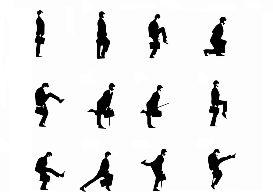
As of today, with Deep Learning and only 2D RGB images as inputs, we can build fairly robust models for static gesture recognition. Though, the more promising application for continuous gestures recognition still faces many challenges and is an open problem.
This article is intended for Data Scientists who have at least basic understanding of machine learning and deep learning in computer vision.
Most problems in gesture recognition are associated with accuracy and performance. For instance, different people might perform the same gesture differently in both speed and movement range. This greatly increases the complexity of the problem if we have many types of gestures. In this article, we will restrict our discussion only to hand gestures as they are the most important features for many gesture recognition tasks.

1. Natural Language Generation:
The Commercial State of the Art in 2020
4. Becoming a Data Scientist, Data Analyst, Financial Analyst and Research Analyst
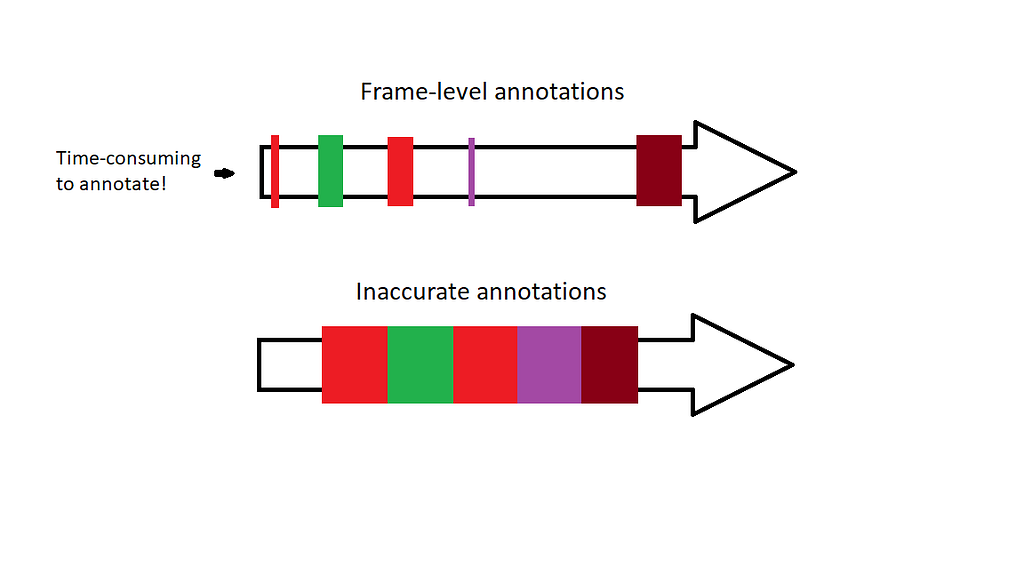
Let’s address the problem of acquiring a frame-level dataset for continuous hand gesture recognition. This problem was addressed by a paper from 2016 where the authors train a CNN on 1 000 000 images using weakly supervised learning. Their algorithm takes advantage of the Expectation-Maximization (EM)-algorithm and “inaccurate” labels in order to train a fairly robust CNN model on different hand shapes. In other words, through clustering the model learns different hand shapes. This is a time-saving approach if you want to create your own frame-level dataset for handshapes.
The gestures are characterized by spatial movements of the hand through the time, therefore our model must be able to capture spatio-temporal features. In other words, the model will handle 2D images (spatial features) through time (temporal features). Here I list some approaches that can be explored and tested:
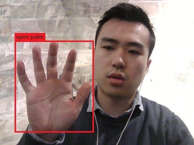
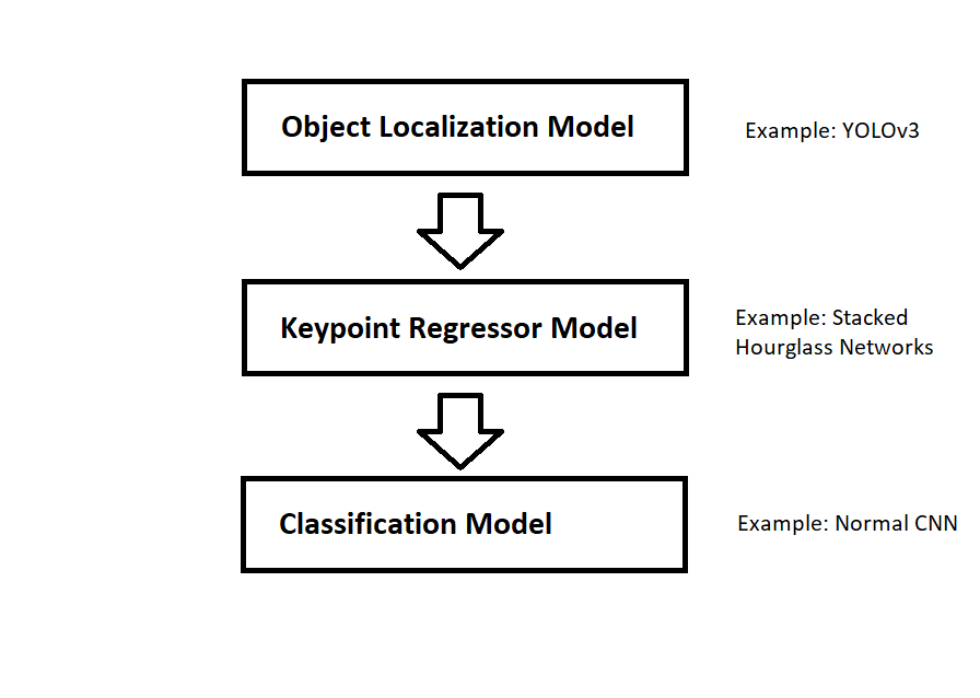
The next steps are to decide the following


A Technical Introduction to Gesture Recognition for Data Scientists was originally published in Becoming Human: Artificial Intelligence Magazine on Medium, where people are continuing the conversation by highlighting and responding to this story.

Featuring more data engineering with SQL, Wheat Detection Kaggle Competition and research exploring demographic biases in facial recognition technology.
Welcome to My Week in AI! Each week this blog will have the following parts:
This week’s focus has been more data engineering. I have finished the ‘Master SQL for Data Science’ learning pathway on LinkedIn Learning, and I found it very useful and interesting. I am planning to learn more about document databases (specifically MongoDB) and graph databases (specifically Neo4j) and am currently setting up my own projects on both of these platforms to dive deeper into their intricacies. Up next for my big data and data engineering learning is Hadoop and Kafka and more advanced Spark.
I’ve also been working on a project: the Kaggle Wheat Detection competition, essentially an object detection computer vision task. The aim is to identify individual wheat plant heads in images of agricultural fields and there are two main challenges associated with this: plants may be very dense and so identifying individual heads is difficult, and images may be blurred due to wind. My first step for this project was loading and cleaning data, and now I am trying some fast and rough transfer learning approaches to understand the baseline accuracy I can achieve. Further steps for improving accuracy might be augmenting the training data, training my own classifier, and using transfer learning to generate image embeddings as an input to my own classifier.
1. Natural Language Generation:
The Commercial State of the Art in 2020
4. Becoming a Data Scientist, Data Analyst, Financial Analyst and Research Analyst
This week’s research paper is in a field I touched on in my post from last week, ethics and fairness in AI. Some concern exists amongst local and federal government agencies about inconsistencies between different demographic groups when identifying faces using facial recognition technology. This has led to several US cities and other governing bodies banning the use of such technology in the public sphere.
The research I’m highlighting this week is by Garcia et al. and titled ‘The Harms of Demographic Bias in Deep Face Recognition Research’.¹ The authors showed that the accuracy of three state-of-the-art facial recognition algorithms dropped significantly for non-Caucasians compared to Caucasians, and for women compared to men. The algorithms they tested were VGGFace, DLib and FaceNet. The authors presented the results as the mean euclidean distances between the face embeddings of different subjects within each of the demographic categories tested. For example, they found that the mean euclidean distance between the embeddings for Caucasian Male samples was ~1.343, but only ~1.02 for Asian Females, when using the FaceNet algorithm. This means that Asian Females had more similar embeddings on average, and so were more likely to be misidentified. This difference of ~0.3 between the two demographic groups is significant relative to typical euclidean distance values for such embeddings.
After evaluating the facial recognition algorithms on data of different demographic groups, the researchers demonstrated the ease of performing a morphing attack on these algorithms in an automated border control (ABC) scenario. ABCs use facial recognition software to compare a person to the image on their travel document, and open immigration gates if the two are deemed a match. A morphing attack involves an accomplice and an imposter who work together to create a fake document with a combination of their two faces. Garcia et al. developed morphed images from a set of ‘accomplice’ images and tested these on the FaceNet algorithm. They found that attacks based on Asian faces worked 4.32% the time compared to 0.27% of the time for Caucasian faces. This is a practical illustration of the consequences that demographic bias in facial recognition technology can have.

Stay tuned next week for a look into big data technologies and some more emerging research. Thanks for reading and I appreciate any comments/feedback/questions.
[1] R. V. Garcia, L. Wandzik, L. Grabner and J. Krueger, “The Harms of Demographic Bias in Deep Face Recognition Research,” 2019 International Conference on Biometrics (ICB), Crete, Greece, 2019, pp. 1–6, doi: 10.1109/ICB45273.2019.8987334.


My Week in AI: Part 2 was originally published in Becoming Human: Artificial Intelligence Magazine on Medium, where people are continuing the conversation by highlighting and responding to this story.
Via https://becominghuman.ai/my-week-in-ai-part-2-4bc3d61958e5?source=rss—-5e5bef33608a—4
source https://365datascience.weebly.com/the-best-data-science-blog-2020/my-week-in-ai-part-2
Artificial Intelligence, also known as (AI) is a branch of computer science that focuses more on the development of intelligent machines…
Continue reading on Becoming Human: Artificial Intelligence Magazine »
Originally from KDnuggets https://ift.tt/2BWHQME
Creating and understanding a histogram is an integral part of any data analysis process. In fact, if your work or education is in any way related to a quantitative discipline, you’ll most likely be required to make a histogram of your own or examine results featuring one. Not to mention that in today’s data-driven world, a strong data visualization skillset is one of the gateways to a successful career in data science.
That’s why in this tutorial, we’ll show you how to create a histogram in R.
More specifically, you will learn how to make a GGplot2 histogram. You’re about to find out how to use one of the most popular visualization libraries in R. And, what’s more, you will be able to add the ggplot histogram to your own analysis.
So, let’s get started, shall we?
A histogram is one of the most useful tools to understand numerical data.
The first thing you need to remember is that a histogram requires precisely one numerical feature.
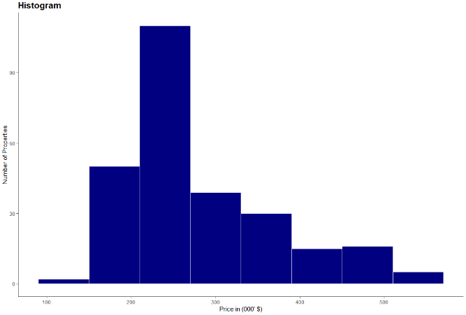
A Histogram shows the distribution of a numeric variable. The variable’s range of values is split into intervals, represented by different bins. The height of the bins shows the number of observations within an interval.
At this point, it’s worth mentioning another key aspect of a histogram.
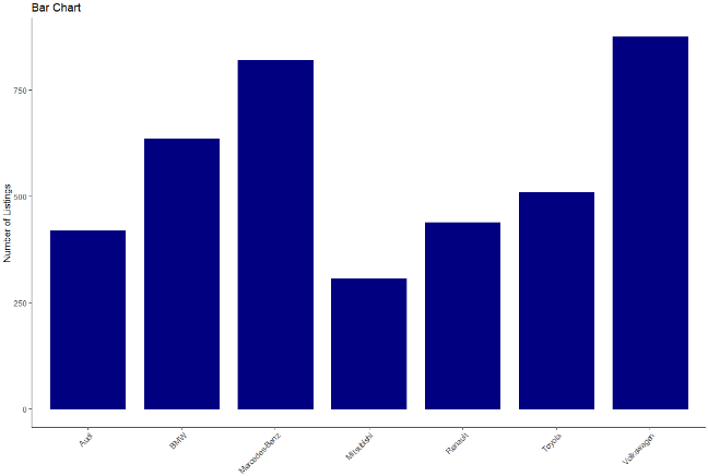
You may have noticed that it looks similar to a bar chart. However, histograms bins show neighbouring intervals. Hence, there is no space between the bins of the histogram, unlike between bars in a bar chart.
Now that you know what is a histogram and what is its purpose, let’s start work on our actual ggplot2 histogram.
When it comes to data analysis and statistics, R is one of the most popular choices among data scientists.
And when it comes to visualizing data in R, there is one clear stand out choice – ggplot2. ggplot2 is one of the most popular data visualization libraries in the R language. So popular in fact, that there is now a ggplot2 library in Python, based on the R version. So, it supports more than one single programming language.
But no matter which environment you’re programming in, to obtain a histogram, first, you need some data.
For our histogram, we’ll be using data on the California real estate market.
In a new variable called ‘real estate’, we load the file with the ‘read CSV’ function. We also specify ‘header’ as true to include the column names and have a ‘comma’ as a separator.

Here, if your data file isn’t in your main r folder, you must also include the path’s location to your file, as well.
After loading the data we’re able to explore it in more detail with the aid of the environment pane. By clicking on the real estate variable, we observe that our real estate data frame contains a little over 250 observations and a total of 9 features.
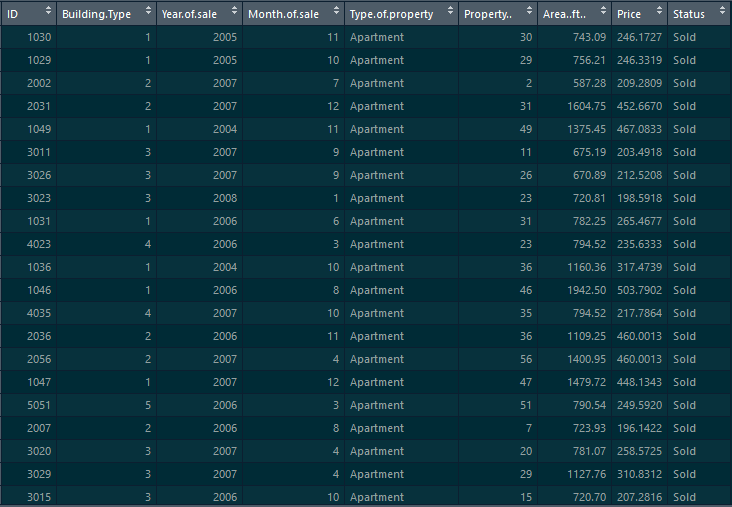
However, we rely on a single feature for our histogram, namely ‘Price’. As we’ve discussed, a histogram requires precisely one measure.
With that in mind, let’s proceed with creating our Histogram with the help of the ‘GG plot’.
We start with the data layer, which is our ‘real estate’ data frame.
We move on to the aesthetics and as discussed, we’re creating a histogram of ‘Price’. Hence, we need only specify the ‘Price’ column here.
Lastly, the third layer is geometry. To create our histogram, we must use ‘geom histogram’.

After executing the code, we obtain our gg histogram.
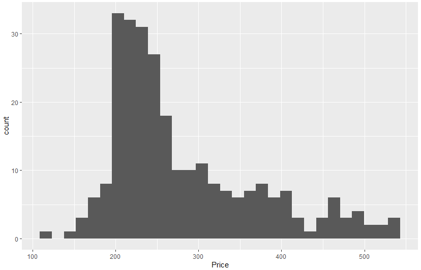
Now, we can examine our newly obtained histogram. It shows 30 different bins, which is the default number in a ‘GG histogram’. However, based, on our data, a smaller number would be more appropriate.
Choosing an appropriate number of bins is the most crucial aspect of creating a histogram. Through varying bin sizes, a histogram can reveal vastly different insights. This is a broad topic and examining it in more detail would require a tutorial on its own!
But here, we stay on the practical side of things and see how to alter a histograms bin size in a ‘GG plot’.
We can achieve this through the bins parameter. In the geometry layer, we add another parameter, which is bins. For this histogram we make it equal to 8.

Also, in this layer, we’re able to control additional aspects of our histogram. For instance, we can specify the ‘bin width’, ‘boundaries’, even ‘geometries’ of our histogram. Feel free to explore these options when you’re creating your own histogram.
We‘re moving on to some styling options (but we encourage you to explore additional options for a ‘GG histogram’ on your own, as well).
One of the most crucial aspects of every visualization is the colors we choose to display it. And while remaining with the default is always an option, taking that extra step and choosing a custom color is what sets your visualization apart.
For our histogram, it will be a blue color – close to our hearts. It’s the 365 Data science blue, which has the code ‘#108A99’. Altering the color is achieved with the ‘fill’ parameter.
Now, in a GG histogram, unlike a bar chart, there is no space between two neighboring bins. All the bins seem as if they’ve been glued together which, sadly, makes the bins less distinguishable. But we can avoid that by adding a white border for each bin. That way we’re creating separation among the blue bins. We can control the border color through the ‘color’ argument, so we set it to white.

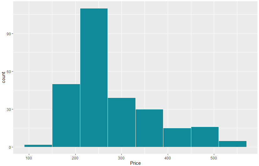
This is already an excellent result! However, there are a few additional elements, aside from color, which could really set your chart apart.
You can style a chart by customizing its theme. The default in a ggplot has a grey background. But this isn’t fitting, especially with our brand new color. So instead, we’ll rely on a ‘classic theme’. A classic theme has a clean design and a white background.
And of course, we cannot leave our histogram without a title. We include a title with the help of a ‘GG title’. It reads as ‘Distribution of Real Estate Prices’. Here you could do with increasing the title size. This can be achieved by adding a theme layer with a ‘plot title’ element. We need a ‘text element’ and in the brackets let’s choose a ‘size of 16’ and the ‘face’ to be bold.
While we’re at it, some axis labels wouldn’t go amiss. With ‘xlab’ we set the x-axis label to ‘Price in thousands of dollars’. For ‘ylab’ we have ‘Number of Properties’.

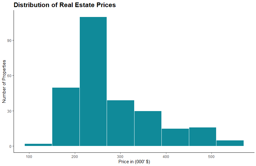
And that’s all folks! With just a few, carefully curated steps, we’ve achieved a professional and well-styled histogram. We relied on ggplot2’s capabilities in R and then used our knowledge and aesthetics to further transform the histogram. This way we ensured that our chart is the best it can be.
The topic of how to create a histogram, and how to create one the right way is a broad one. And this tutorial’s goal was to provide you with all the necessary steps to create a ggplot histogram in R. However, you shouldn’t limit yourself to one environment only. So, if you’d like to develop your data visualization skillset in technologies like Python, R, Tableau, and Excel, check out our Complete Data Visualization Course.
Try Data Visualization with Python, R, Tableau, and Excel Course for free!
Next tutorial: How To Make a GGPlot2 Scatter Plot in R?
The post Histogram in R: How to Make a GGPlot2 Histogram? appeared first on 365 Data Science.
from 365 Data Science https://ift.tt/2OaOMrQ